
The Curse of Minimalism & Segregation Rant!
Does anyone other than architects and interior designers really like minimalist design?
Yes, minimalism looks great when you are flipping through a magazine, but it doesn’t really invite the eye or the feet to explore looking for interesting details and fun decorative elements. The goal of minimalism is to use the fewest number of elements to get the maximum visual effect. In Calgary, we have a Minimalist District – 48 blocks of mostly minimalist office buildings from 9th to 3rd Avenue and Centre Street to 8th Street.
Does minimalist buildings mean minimalist street life. Has minimalism contributed to the decline of North American downtowns? Do we need more clutter?
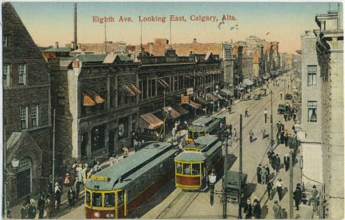
It wasn’t always like this. Look at any early 20th century picture of Calgary’s downtown’s 8th Avenue aka main street and you will see what I mean. The streets are full of people, horses, wagons and cars. Signage is plastered everywhere. It is a total “gong show.”
While this blog focuses on minimalist architecture in Calgary, it is an issue for most North American downtowns.
Vibrant streets allow for a diversity of different activities - pedestrians, cars, transit. They allow jay-walking. Awnings add colour and can also be used as signage. Human scale is also important. Highrise towers dwarf pedestrians, making the sidewalks below pedestrian unfriendly.

Today 8th Avenue aka Stephen Avenue walk is a pedestrian mall by day and a one way road at night. Plans are in place to make it a pedestrian mall 24/7 in the hope that it will attract more people to the shops and restaurants. Plans are also being developed to add three minimalist towers to the block 66, 54 and 24 floors that will dwarf the historical buildings and its early 20th century sense of place.
Today, Calgary’s 7th Avenue has been converted into a transit corridor for LRT trains and buses. The few shops along this street struggle to survive. Wonder who decided it was a good idea to randomly place a useless grey ball in the middle of the platform.
Learning to love clutter again
When it comes to urban living and urban spaces I think the really interesting places are blessed with the clutter of people, signs, banners, buses, cars and bikes. They are not places where we segregate pedestrians, transit and cars to different streets. It is not where bike paths skirt the outside of the city centre.
I was reminded of this whenever I see Fred Herzog’s images of downtown Vancouver in the ‘50s and ‘60s. These photos are visually stunning and intriguing with their cacophony of colour from the multitude of signs to the people that inhabit the street. It made me think “Where have all the blade signs gone? Where has all the neon gone?”
Blade signs are the ones the stick out over the sidewalk so you can look ahead and easily see what stores lay ahead. Blade signs work well both for pedestrians, cyclist and cars. They work much better than signs flat to the building’s façade which you can’t see until you are at the store and/or building. It is not the cars that are enemy to street vitality; in fact they are an integral part of it.
As Petula Clark sang "the lights are much brighter downtown," in the 1960s. This is no longer true! (Fred Herzog, photograph, Downtown Vancouver at night)
Sidewalk Ballet
Jane Jacobs called it the “sidewalk ballet” - people moving around each other, jumping out of the way of a sandwich board or twisting to miss the lamppost that suddenly appeared out of nowhere. It is not only the pedestrians, but also the bikes, cars, taxis and buses. Others have talked about the importance of “messing urbanism” i.e. good urban places are not the result of master plans, but happen over time and are a result of a diversity of activities and design elements. It is organic, not pragmatic.
The enemy is “minimalism.” It is minimalist design that results in modern buildings that don’t add any visual interest for those walking along the sidewalk. It is the “signage Nazis” who doesn’t want signage to be too visible, to attract too much attention away from the building’s design.
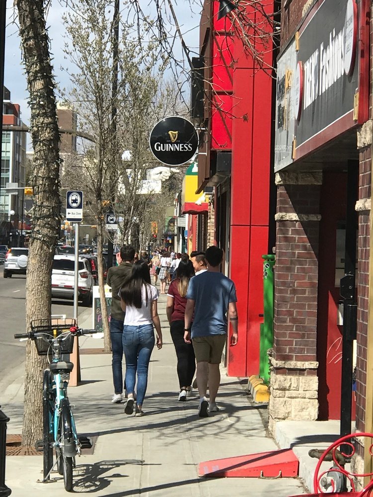
Minimalist design means minimal street life.
In Caglary we have internalized all of the street shops and placed them on the second floor out of sight of the street. This creates a nice clean look at street level; we don’t want any of the clutter of doors, shop signage and windows and people walking in and out at street level. It is minimalism that favours the one entrance to an austere lobby with nothing in it.
Imagine what the streets and avenues of downtown would be like if some of the food courts vendors were move to the street. Even when the shops are on street level, like TD Square, Bankers Hall, Bow Valley Square they are not allowed to interact with the street i.e. the entrances are all internal.
You look down the streets and avenues of Calgary’s downtown and there is nothing to visually engage the eye or the mind, nothing to capture your imagination, nothing to say “I’d like to walk down that street to see….”
Why, because for the most part it is a wall of glass, concrete and granite in various shades of grey, beige and blacks.
Bring Back The Past
We need to bring back some detailing, textures and design at street level. Bring back the colour of multiple canopies and awnings that marked the entrances to the shops along the streets. FYI: Holt Renfew use to have a specific awing for each season.
Walking down the streets there is none of the texture and details that use to be part of a building’s design. Don’t believe me. Check out the wonderful intricate iron canopy over the Burns Building on Macleod Trail at Stephen Avenue; this is urban beauty.
Example of decoration and ornamentation of early 20th century buildings.
Notice the detail of the colonnade of the historic downtown Bay Store vs. any of the office building colonnades of the late 20th century. Too often the pillars of modern office buildings that populate the sidewalks are simple cylinders with no ornamentation.
No longer does the pedestrian’s eye enjoy the rich decorative details of columns like those that distinguish the grand entrances of the historic Federal Public Building and Bank of Montreal built on Stephen Avenue both completed in 1931.
No longer do the facades have subtle details like the Bank of Nova Scotia’s Art Deco carvings of prairie wild flowers, Mountie and First Nation figures, as well as horses, buffalo, guns and arrows.
Yes these are subtle street design details, but they are part of the urban fabric that made wandering the streets of downtown interesting in the past.
There were critical to creating urban beauty, something that has been lost with the “rise of minimalism” in the latter half of the 20th century.
The Hudson’s Bay arcade has lots of ornamentation. Even the sidewalk is decorated. Lots of textures and details to attract the eye and hold your attention.
Minimalist streetscape design of late 20th century, create boring streetscapes.

They don’t build banks like this anymore.

Another example of attention to detail at street level from mid 20th century buildings, is the Federal Building, now the Jack Singer Concert Hall.

Unfortunately the rest of the Arts Commons complex (formerly the Epcor Centre, formerly Calgary Performing Arts Centre) is less visually exciting.
Stand-offish Office Towers
The modern office building is set back from the sidewalk in a manner that is kind of “stand-offish.” They remove themselves from the “street ballet.” While the Bow offers a wonderful piece of public art, it doesn’t really create any “ballet.” The same for the southwest plaza of Bankers Hall, it is full of public art, but there are never any people there, except the smokers.
One of the best places for experiencing the “street ballet” I have ever seen is the Kowloon District in Hong Kong. There is a great mix of street types from Nathan Road a neon main street (think Las Vegas without the huge hotels), Cheung Sha Road and Apliu Street and numerous street markets. These streets of Kowloon are cluttered. There is no sense of a unifying design. There are no bike lanes, no pedestrian cross walks. Yes, it is a “free-for-all.” Yes, there is signage of all shapes and sizes. And yes, the streets area always full of people, cars, bikes, carts and vendors mixing and mingling. I doubt there is/was a master plan? No architectural guidelines. No minimalism here.

Brookfield Place, 2017 (on the same block as the Herald Building)

Herald Building, 1913

Modern restaurant storefront and patio in winter.

Early 20th century storefront and patio.

Early 20th century commercial building

Early 21s century commercial store front.
Last Word:
Downtowns need more ornamentation and less minimalism to create a pedestrian friendly streetscape. They also need more clutter and less segregation of activities and modes of traffic.
Learn more about making downtowns fun again!
Let’s make downtowns brighter!
Montreal: Canada’s best urban playground!
Austin is more fun than weird!