
Calgary Condos: A Pop of Colour
Calgary’s suburban communities have often been critized by urbanists as brown, beige and boring. The same could be said for most of Calgary’s early City Centre condo towers like Westmount Place (1979), The Estate (1980) and Eau Claire 500 (1983) immediately come to mind.
It is true - the preponderance of dull and dreary brown and beige buildings makes for a very depressing urban landscape, especially during Calgary’s winter when the grass is brown, the streets are covered with gravel and the leafless trees are a brownish grey.
Thank goodness for Calgary’s deep blue winter skies!
Fortunately at the turn of the 21st century, Calgary architects and developers began to experiment, integrating coloured glass and panels into their exterior designs.
GEC Architecture utilized bold colours to create
Pop of Colour

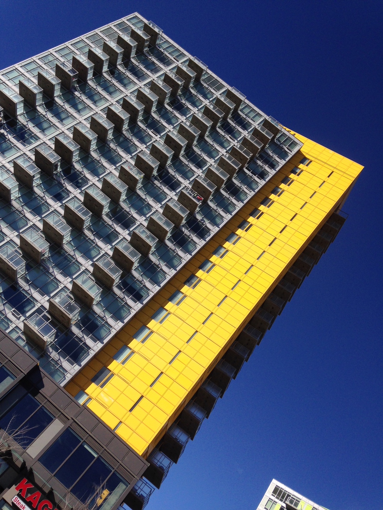
The front entrance of Pixel looks like a hip New York nightclub.
Battistella Development’s Orange Lofts (2003), designed by Kasian Kennedy of Vancouver, used a bright orange-red, ladder-like element on the exterior of the building creating an eye-catching industrial look that began the rebirth of East Village.
Colours (2008) employs a two-story, stain glass like “Art Wall” that encloses and attractively disguises the building’s above ground parkade.
Pixel (2014) not only sports bright yellow squares randomly wrapping around a few balconies but also has a very cool and colourful entrance that looks like a hip New York nightclub.

Colours by Battistella has one of the best above-ground parkade designs I have ever seen.
Not to be outdone, Knightsbridge and Metropia engaged Calgary’s GEC architects to design four big, bold and colourful condos at the Brentwood LRT station from 2010 to 2014 named University City. Each tower is distinguished by a brightly coloured angular plane that thrusts itself out of the middle of the each building.

University City's colours remind me of neighbourhood playground. This playfulness will become more appropriate as the planned transit oriented develop next to the Brentwood LRT station creates an urban playground.

The inspiration for University City's colours (red, yellow, green and orange) come from native prairie grasses, bushes and flowers.

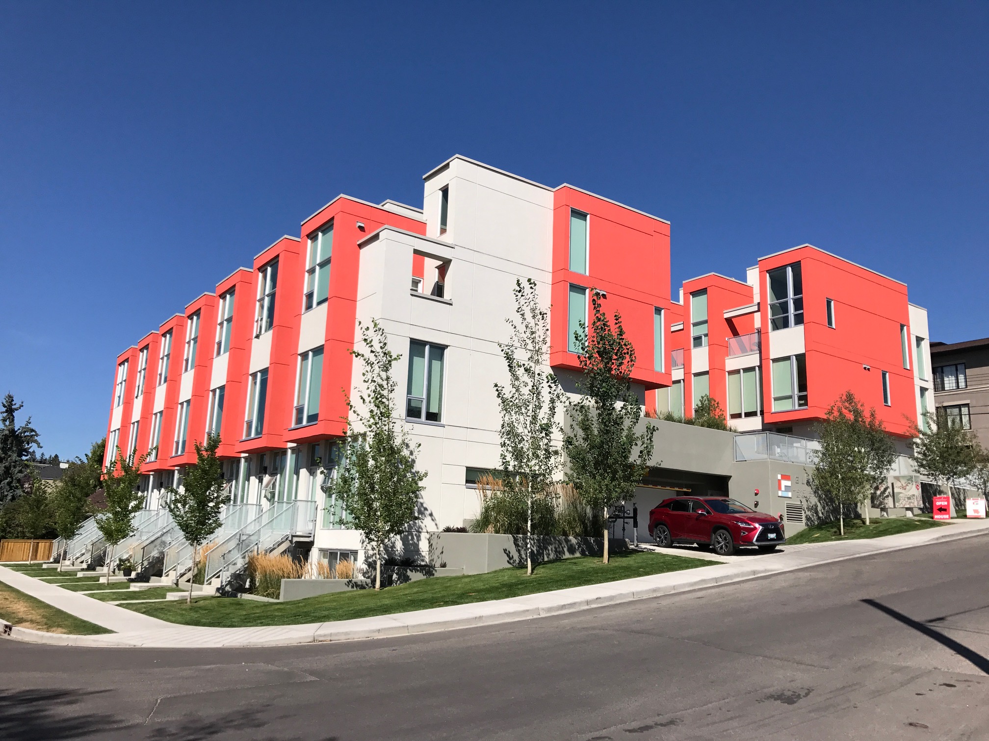
The I.D. Inglewood condo by Sarina Homes completed in 2016 at the east end of 9th Avenue SE, features three-storey high red balcony boxes that recall the red ladder of the Orange Lofts and perhaps the Alberta Children’s Hospital windows.
Marda Loop’s GLAS condo (2017) designed by Calgary’s Sturgess Architecture recently won a Honourable Mention at the Mayor’s 2017 Urban Design Awards. Its design is dominated by the two-storey high salmon-coloured window boxes that definitely recall the fun oversized windows of the Alberta Children’s Hospital.
GLAS in Marda Loop

Alberta Children's Hospital was designed with input from children.

NORR architects employed bold coloured lines to give Auroa I both a vertical and horizontal thrust.
All these examples use pops of bold colour to create a more visually interesting exterior. However, that is not always the case.
Colour Gone Wild?
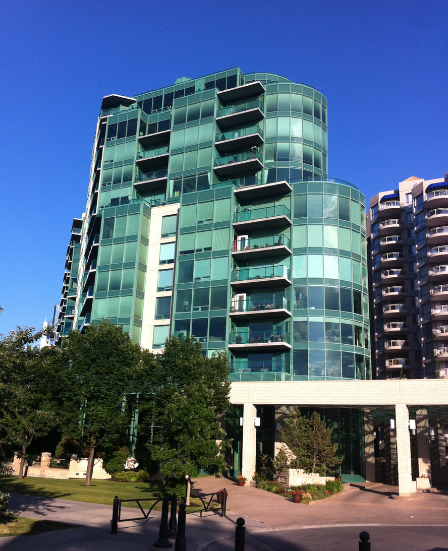
Built in 1999, the Point on the Bow condo in Eau Claire is a case in point. It was Calgary’s first condo to embrace the new coloured glass curtain wall technology that would become architects “go to” technology in the 21st century.
The architects at Gibbs Gage covered almost the entire façade with emerald green glass that some thought harmonized nicely with the green hues of the Bow River at certain times of the year.
Others think it was a case of “colour gone wild.”
And then there is Attainable Homes’ Mount Pleasant 1740 condo designed by Calgary’s Sturgess Architecture and completed in 2016. The façade is dominated by glowing (some say gaudy) neon greenish yellow panels that may have residents across the street wearing sunglasses.
There is certainly nothing drab or boring its design.

Dare To Be Different
All the above examples employ the use of bold colours. However, Landmark-Qualex’s Mark on 10th (corner of 10th Ave and 8th St SW) dares to be different. Designed by Vancouver’s Raffi architects, it incorporates panels of pastel blue, yellow and green hues randomly inserted into the opaque panels, creating a softer more feminine façade. The uniqueness of the building is reinforced with the cantilevered yellow box at the top and the two-storey yellow glass greenhouse space with its bamboo tree growing at the 10th Ave entrance.
The design is bold yet subtle.

Mark on 10th utilizes several pastel colours with a strong vertical and horizontal lines to create a contemporary stain glass design that recalls the art of Piet Mondrian.

Arriva completed on 2007, also utilized pastel colours to create a warm and inviting facade enhanced by the contrast between the curved balconies and the sharp edges of the windows and corners of the building. There is a pleasing softness to this rounded design.
Last Word
Incorporating colour and architecture is not as easy as one thinks. If not done right, it can quickly make a building tacky, gaudy and often becomes quickly dated. I have even heard from different sources that “architects are afraid of colour.”
Perhaps that is why most timeless architecture has little colour.

NORR architects edgy new University of Calgary residence creates a strange juxtaposition withthe beige residences from the 70s and 80s that surround it.
An edited version of this blog was published in the Calgary Herald's Condo Xtra magazine, February, 2018, hence the focus on condos in this blog.
If you like this blog, you will like these links:
The Art of Architecture & Colour
Downtown Calgary: Black & White / Inside & Out