Vancouver Hidden Gems: Art & Architecture
Nothing makes me happier than discovering a hidden gem when exploring a city. It always amazes me how I can find new things even in a city or neighbourhood I have visited many times.
Vancouver is full of hidden gems partly because it is full of new developments which bring new hidden gems. On my most recent trip, I discovered a medical clinic full of contemporary art, two off-the-beaten path pizza parlours, an art gallery with hundreds of artworks for rent and a block with two funky bookstores and another block with two great examples of modernist architecture.
800 Block Chilco Street
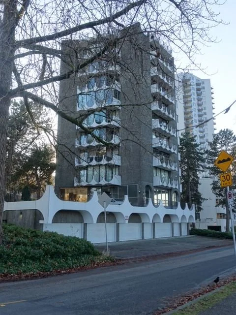
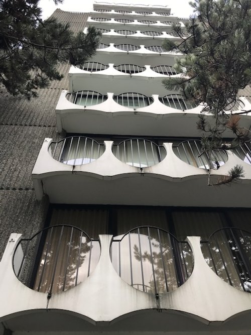
Located at 815 Chilco Street facing Stanley Park’s Lost Lagoon is a Charles Burwell Kerrins Van Norma ribbed concrete residential tower that immediately jumps out at you with its huge eye-glass like balconies. I am thinking if Elton John was an architect he would design a building like this. C.B.K. Van Norman is considered to be the “father of modern architecture in Vancouver.”
815 Chilco Street
Get closer and you will discover the hand-etched steel door by Lutz Haufschild that looks like something from Lord of the Rings or some sort of geological rock slab. In the lobby is a coloured glass and concrete wall, also by Haufschild, that looks like it is from the Flintstone era.
Built in 1970, the building is way ahead of its time when it comes to luxury urban living, with each floor being only one home which means every resident has their own elevator stop.
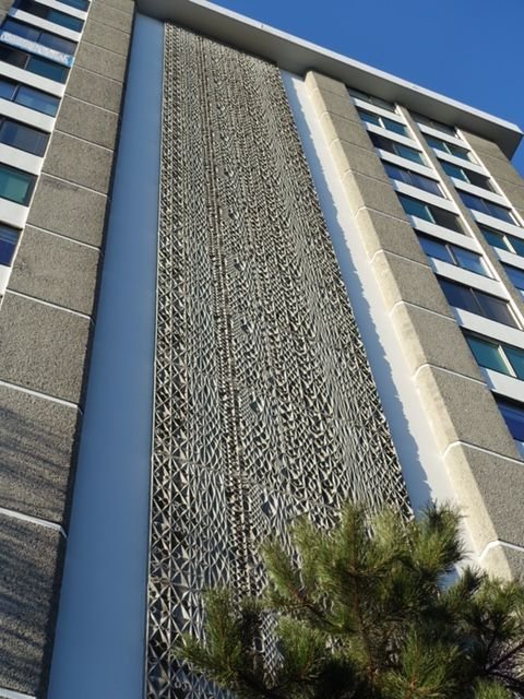
Just down the block at 845 Chilco is Lost Lagoon Terrace, a 14-storey concrete tower which also has just one home per floor. From a distance it is very unassuming, but get closer and there is a concrete abstract relief artwork that stretches from the ground to the roof-top. The artwork is like a huge waterfall as there is a fluidity to the various shapes and forms that reminds me of the ripples and reflections of light off moving water. This building was designed by Kenneth H. Gardener but I couldn’t find anything about who designed the 14-storey artwork, perhaps the architect?
It is very interesting that there if very little written up about these two classic examples of modern brutalist architecture and their artwork.
Backstory: I often wondered why it is called the “Lost Lagoon” when it is in plain sight on the edge of Stanley Park closest to the city. Turns out Emily Pauline Johnson called it the “Lost Lagoon” in a poem and the name stuck. The Lost Lagoon by Emily Pauline Johnson
815 Chilco Street
815 Entrance Door
detail
Door detail
845 Chilco Street
Detail of waterfall on side of 845 Chilco Street
Footbridge Clinic Art Gallery
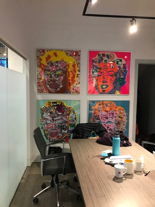
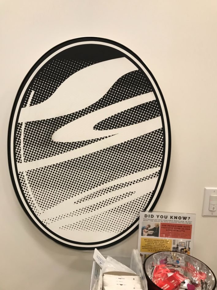
The last thing you expect when you are visiting a medical clinic is to find a lobby that looks like a contemporary art gallery with huge artworks on white walls. But that is exactly what happens if you visit the Footbridge Clinic in Vancouver. I was immediately gobsmacked by the ‘60s pop art with references to Roy Lichtenstein and Andy Warhol, but these weren’t posters.
Once we got to the examination room there was more art (literally pretty much everywhere) and more diverse styles and subject matter.
I started taking photos when nobody was looking and figured if someone stopped me I would ask for forgiveness.
Near the end of my visit, the guilt got to me and I asked Eric the physio guy “What’s with all the art?” He immediate said it is Douglas Coupland’s collection, some are his and others are from his personal collection. WOW.
FYI: Douglas Coupland is one of Canada’s leading contemporary artists (both visual and literary), widely exhibited around the world. He coined the term Generation X and in Calgary he developed the programming for the light show on the side of Telus Sky tower.
Eric gave me the Clinic’s Manager contact information so I could get permission to post about the clinic/gallery in a blog. To my surprise the next day I got an email from Doug, providing me with more info and permission. Later I also got one from the Manager also giving me permission so here is a sample of some of the art. In many cases the photos aren’t the best as I couldn’t get the right angle in hallways or light was reflecting off the glass. But I think you get the picture.
Not only did the art appeal to my love of colour and playfulness, but so did the overall design of the space. Too bad, Brenda had to break her arm, for us to discover this hidden gem.
Shaw Tower Street Windows
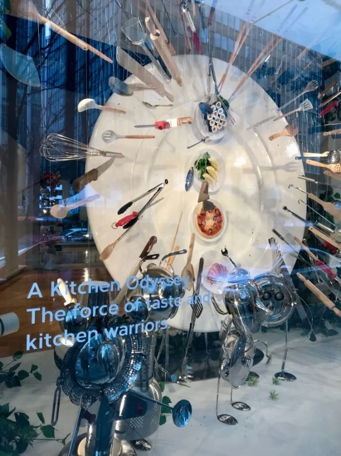
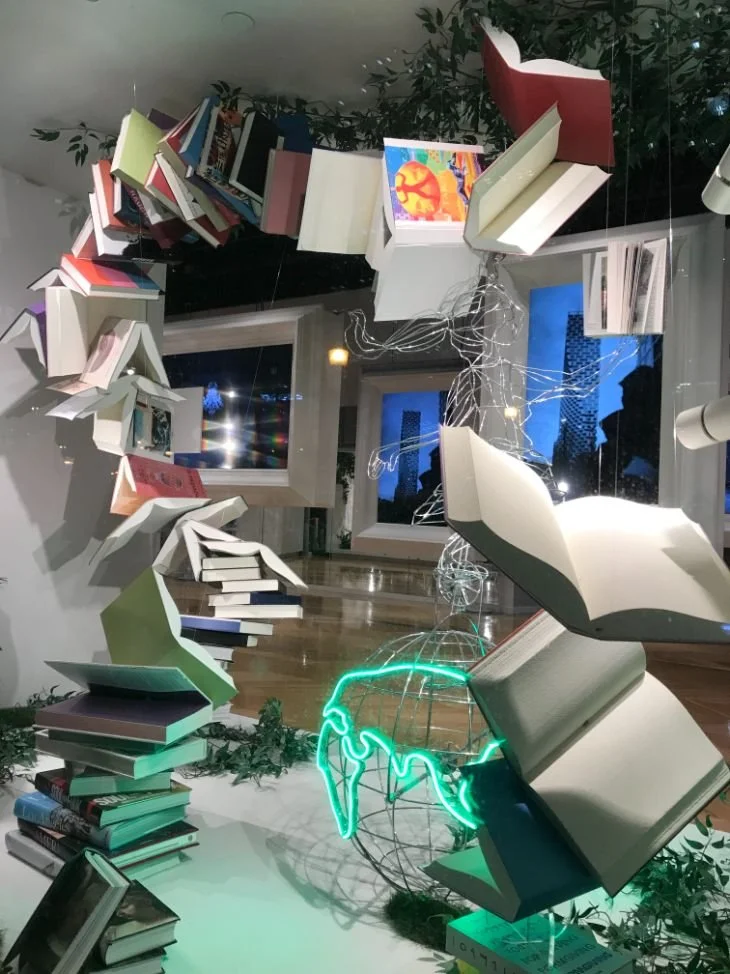
I love a good street window i.e. ones that looks like a mini art installation, most often found along streets with luxury department stores or high-end fashion boutiques. I was surprised to find some amazing window along West Cordova St. at the base of the Shaw Tower. I was just wandering the street minding my own business, mostly looking up at the new office and residential towers, when out of the corner of my eye, I spotted a funky looking window display. As I got closer, there were several of them and when I got to the corner of the building there was more.
Each window installation was accompanied by text, a bit of poetry? Or perhaps prose? It was all very ambiguous, very mysterious. I had to circle back and look again at each window trying to make sense of it all. There was no obvious relevance to Shaw’s operations and designer shops. Around the corner was a huge lobby with nothing in it and on the door was a reference to Oakridge Cultural Hub…was this an art gallery, dance studio, multi-purpose space?
Turns out this is the show suite for the massive redevelopment of the Oakridge shopping centre in the suburbs. Oakridge Park: Vancouver’s Cultural Hub
Canopy by day
Canopy at night
Model for new Oakridge development.
Last Word
It pays off to take the sidewalk least followed.
Looking for some more Vancouver Tourist Tips:
Does Vancouver have the world’s happiest sculpture?
Fairy Tale Postcards at University of British Columbia
Jane Jacob’s quintessential Main Street is located in Vancouver?

