Marion Nicoll: Calgary “The Ugly City” vs New York “The Beautiful City”
Thanks to Catharine Mastin’s recent talk at the opening of the Master’s Gallery exhibition – “Marion Nicoll: Works From Private Collections,” I discovered Nicoll, one of Canada’s important (but lesser known) abstract painters loved New York City and thought Calgary was ugly. “OUCH!” The exhibition runs from May 26th to June 7th, 2023.
I am not surprised Nicoll thought New York City, in the middle of the 20th century, was a beautiful place given it was the birthplace of abstract art, an art form she was exploring. Unfortunately for her, abstract art was not being embraced in conservative Calgary at that time. Nonetheless, I was a bit taken aback that she would paint and title a painting “Calgary The Ugly City,” in 1964.
That said, I expect her view of the two cities was shared by many 60 years ago and in fact, still shared by many today. Ironically, the next day while chatting with a buddy, he said his granddaughter - a dancer living in NYC - thinks Calgary is a backwater when it comes to the arts. He had no idea I was writing this blog.
Nicoll’s belief that NYC is beautiful and YYC (aka Calgary) is ugly is blatantly obvious in these two paintings.
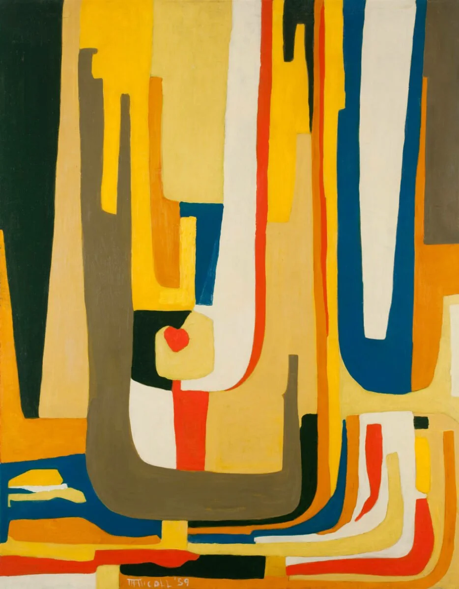
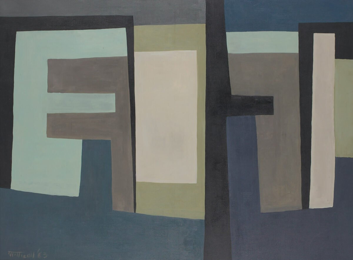
New York The Beautiful City
The New York City painting’s palette is bright and colourful, dominated by yellow hues. This vertical painting creates an uplifting sense of place with its narrow vertical shapes that suggest the city’s tall skyscrapers. There is also a sense of the Hudson River in the horizontal blue streak along the bottom and the sky peeking through the skyscrapers is suggested in the blue and white blocks on the right side of the painting.
There is even a red heart in the middle of the painting. The painting has a heavenly, spiritual element to it, like a stained glassed church window.
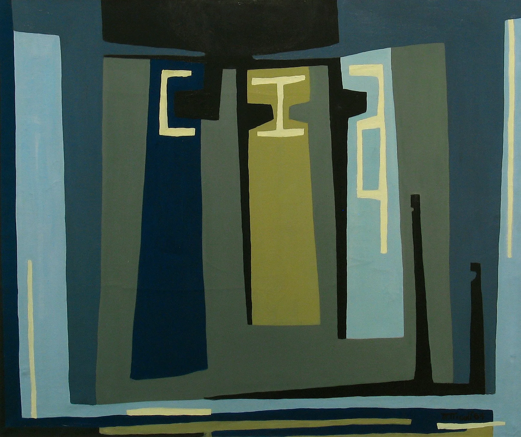
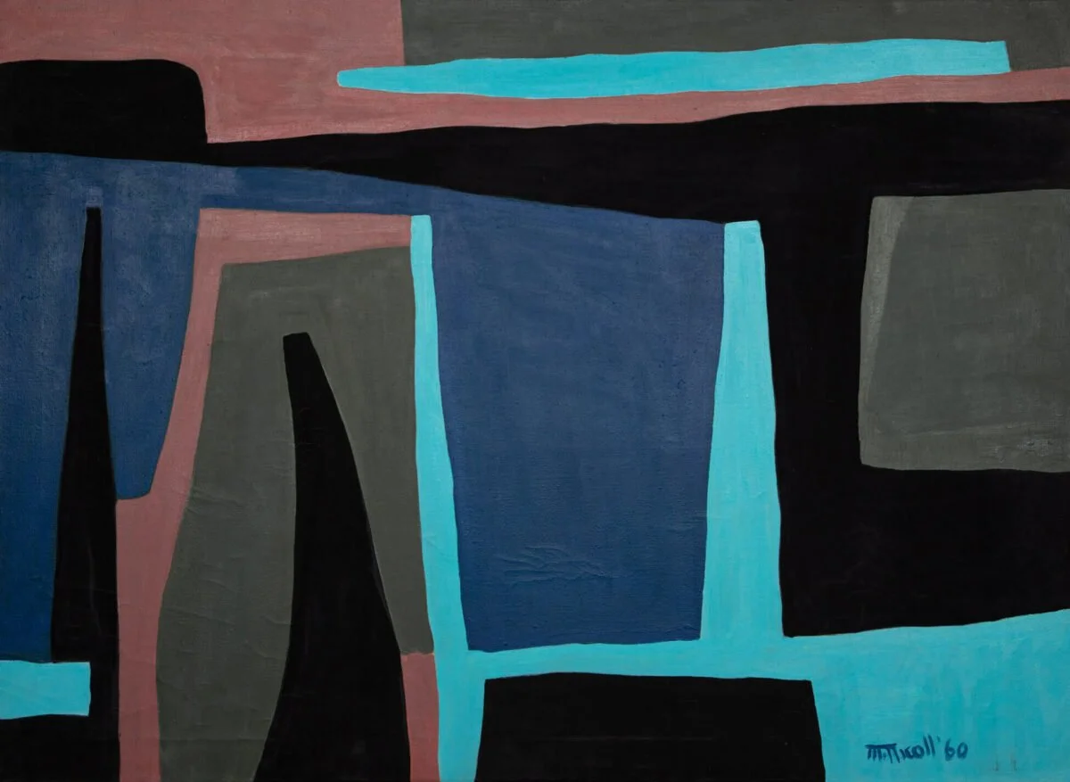
Calgary The Ugly City
On the other hand, the palette of the Calgary painting is the exact opposite, with sombre grey, blue and olive colours dominating. Its composition is less complex, perhaps reflecting Calgary was still a frontier city in the early ‘60s – there was no Glenbow, no Arts Commons, no Contemporary Calgary, no Alberta Ballet etc. The painting has fewer shapes, making it less visually interesting than the New York painting. Yes, some might even say it really is an “ugly painting.”
The Calgary painting also has what looks like three letters “C,” “I” and “A” (or perhaps a “G” or even a “Y”). Could these be some abstraction of the word “CALGARY?” Or perhaps the word “CITY?”
I am surprised Nicoll wasn’t inspired by Calgary’s amazing bright blue sky, iconic Chinook Arch (which she included in another artwork), shimmering blue/green water of the Bow River, the white-capped Canadian Rockies, the sandstone buildings along Stephen Avenue, Nose Hill or the Centre Street Bridge.
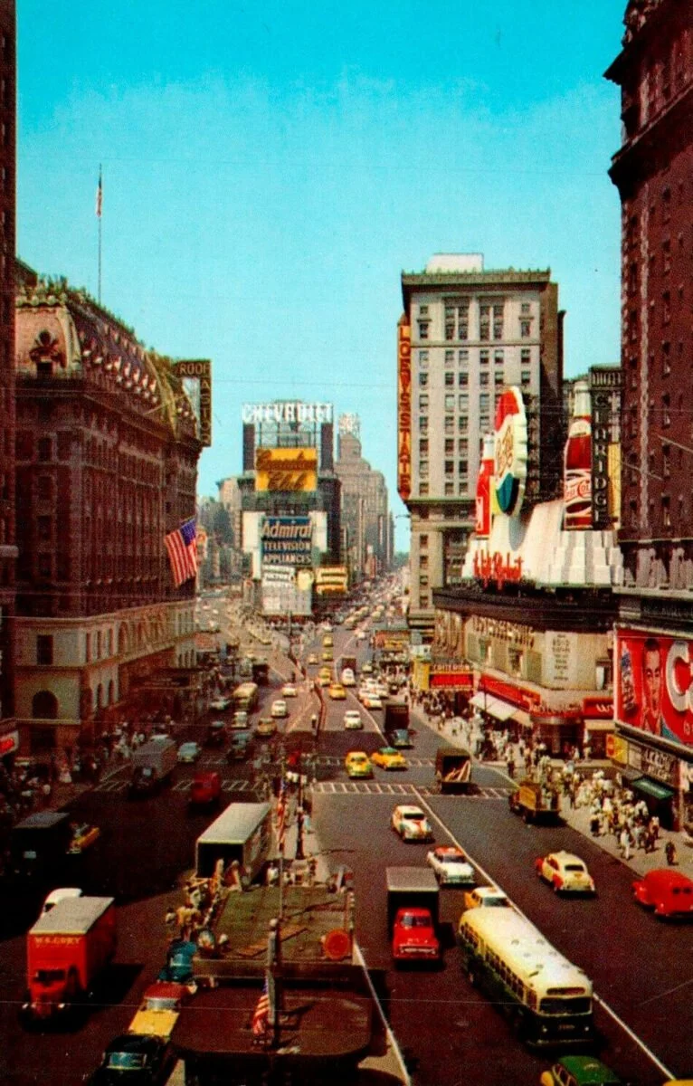
What New York City looked like mid 20th Century?
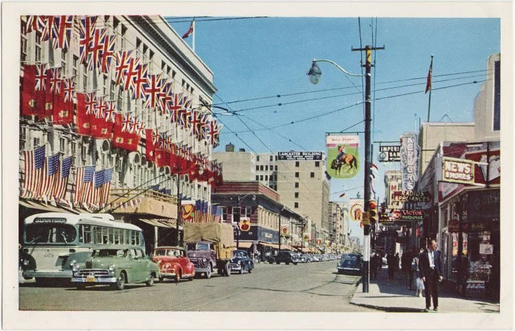
What Calgary looked like mid 20th century.
Mastin’s Book
My interest in cities and love of Calgary prompted more investigation. Here is what I found in Mastin’s book “Marion Nicoll: Life & Work” about the two paintings.
In 1964, Marion Nicoll began a new project inspired by her city of birth—the Calgary Series (I–III), 1964–66. Calgary II: The Ugly City layers blues and greens in block-like shapes and includes the letters “CIA” in yellow bands in the centre of the composition. Of the three paintings in the Calgary Series, this one best reflects the internal conflict Nicoll experienced about her homecoming, emotions that had been brewing since 1959.
When she returned to Alberta after a year in New York and Europe, her teaching position in design and crafts at Calgary’s Provincial Institute of Technology and Art (PITA) remained unchanged at a school still run by men who excluded her from giving classes in painting. This reality continued until her retirement in 1966, despite her many successes in Western Canada and showing in the National Gallery of Canada’s 5th Biennial Exhibition of Canadian Painting 1963. The experience must have felt like a bitter pill after having turned down teaching opportunities in New York because of her husband’s disdain for the city and desire to return to family roots.

Just before painting this work, Nicoll stated that she yearned to live in New York, “where I’m twice as alive. New York is a friendlier place than Calgary…to me it’s the most beautiful city in the world.” The warm red-yellow palette she used in The Beautiful City, created in Manhattan in 1959, met its opposite in Calgary II: The Ugly City, with its cool blue-green palette, the other side of the primary colour spectrum. Usually, Nicoll found impetus in a single location or experience to develop her abstractions but Calgary II: The Ugly City was possible because of its precedent, The Beautiful City.
Nicoll was reticent to offer much by way of spoken words about the meaning of her paintings, noting that, “If my work doesn’t make its own statement, then nothing I can say would make any difference. If it does make its own statement, a written explanation is superfluous.”
Just the same, the integration of the highly charged letters “CIA” is an uncanny connection to the acronym for the Central Intelligence Agency. This American institution was created in 1947 to address foreign intelligence matters and mounting tensions between the United States and the Union of Soviet Socialist Republics. P.W. Martin’s writing on the Cold War, advocating for faith and peace in a troubled nuclear age, had entered Nicoll’s library by 1959.
She had read Martin’s call to personal action: “At a time when it seemed as if the individual citizens were becoming little more than a statistical unit in the modern mass state, it is upon the individual citizen that everything now depends.”
At the very least, Calgary II: The Ugly City marked an important realization that Nicoll could achieve more in her abstractions than her previous paintings, which froze in time only one place. Through careful titling and use of symbol, autobiography, and contrast, her abstractions were becoming more layered and multi-locational.
The oppositions of beauty and ugliness are contrasted in the two paintings, but Calgary II may also signal Nicoll’s intention to establish a comparison of nations. Alongside the Alberta Series, 1960–62, the Calgary Series was among Nicoll’s major bodies of work to respond to her home.
In those groupings, Calgary II has held a critically significant place since the 1970s, having been included in her 1975 retrospective exhibition and serving as frontispiece for the first monograph on her life and art in 1978.
Note: You can read/download the entire book for free online at: Marion Nicoll: Life & Work.
FYI: Nicoll was a contemporary of famous international contemporary colourfield painters Mark Rothko and Hans Hoffman as well as Canadian painters Jack Bush and Emily Carr.
Marion Nicoll, Rome, 1960. While this painting has some brighter colours and more complexity to the composition, it too is somber compared to her portrait of New York City.
Marion Nicoll, Bowness. Nicoll used same colour palette as “Calgary The Ugly City” for her portrait of Bowness one of Calgary’s oldest communities.
Alberta Maverick
Another interesting read is Jennifer E. Salahub’s “Alberta Maverick Marion Nicoll and Abstract Art,” chapter in her book “Bucking Conservatism: Alternative Stories of Alberta from the 1960s and 1970s.” In this chapter, Salahub documents how much Nicoll hated the conservatism and male chauvinism that existed in Alberta, specifically at Calgary’s Alberta College of Art (ACA) in the ‘60s. She was the only female instructor at the College - now the Alberta University of the Arts.
Nicoll spent the 1958-59 academic year in NYC and thrived there, even offered a teaching position at the prestigious Cooper Union for the Advancement of Science and Art. However, her husband Jim Nicoll, also an artist yearned to return to Alberta.

Nicoll’s Prophet is considered to be one of Canada’s finest examples of classical abstraction. Marion Nicoll, Prophet, 1960, oil on canvas, Glenbow Museum; a gift from Shirley and Peter Savage, 1990.
Salahub reports, “Fortunately, Nicoll was awarded a Canada Council fellowship, which eased the financial strain of living in the Big Apple and allowed the couple to travel to Europe for several months before returning home. It was just as well, because, as she confided to a friend, without this break, she doubted she would survive the transition from New York to Calgary: “If I had to return to Calgary straight from here . . . I would slit my throat and bleed messily from here to Times Square.”
Salabhub then adds, “Nicoll’s return to Calgary would indeed be marked by culture shock. She had left the very definition of modernity—the Big Apple and the energy of the virile New York school of art—to return to a parochial Prairie community. Adding insult to injury, she would, according to popular opinion, be working in a cultural void. As Archibald Key, curator of Alberta Artists 1961, indignantly reminded his audience, it had recently been stated in Canadian Art, the nation’s premier art journal, that “there exists, between Ontario and British Columbia, something close to an artistic wasteland.”
Salahub also notes Nicoll’s bold painting Prophet (1960) is perhaps a not-so-subtle nod to her feeling of rejection and alienation - “for a prophet is not without honour, but in his own country, and among his own kin, and in his own house (Mark 6:4). The titles of two other paintings, Ugly City (1964) and Hostile Place (1965), likewise speak volumes about her state of mind at the time.”
Link: Bucking Conservatism: Alternative Stories of Alberta from the 1960s and 1970s.
Last Word
So perhaps it wasn’t so much that Calgary was ugly but rather the Alberta College of Art and Calgary’s lack of a supportive modernist arts community was ugly. In fact, Mastin acknowledged in her talk that when she came to Calgary from Ontario in 1995 to become the Glenbow’s art curator she had never heard of Nicoll and somewhat guilty of falling into the myopic “Ontario thinking” that the Canadian prairies were still an artistic wasteland. She quickly learned, she said, “I was wrong.”
Note:
If you live in Calgary or are visiting, and like abstract art, I highly recommend checking out the exhibition. If you missed it, have a look - and read - of Mastin’s book online (and soon to be published). Master’s Gallery is worth a visit anytime for “art lovers” as it features the work of Canada’s most respected artists. You can’t miss it; just look for the giant Van Gogh face at the corner of 4th St and 22nd Ave SW by the late Joe Fafard, one of Canada’s most respected sculptors.